Modal windows are designed to enhance user experience by presenting new content situationally. By definition, these interstitials obstruct user flow by preventing interaction with the main application. This UI element generally requires a user interaction to initiate its display; however, a page load, scroll event, or an arbitrary timeout is not a justifiable “interaction” for the presentation of a modal window. Presenting a modal window without an appropriate prequalifying event not only disrupts user flow and concentration, it also introduces frustration and confusion.
Those who forget history…
In the early day’s of the web, pop-up advertisements plagued web surfers. The problem became so prolific that browser vendors were forced (by user demand) to implement pop-up blockers to protect users from intrusive advertising aimed at cheap conversion.
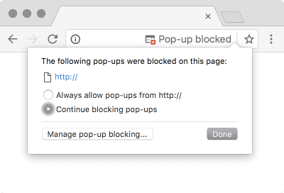
Firefox 0.1 (originally named Phoenix), released September 23, 2002, introduced the first pop-up blocker. Shortly afterwards, on November 13, 2002, Opera 7.0 Beta 1 followed suit. By August 2004, all major browsers included built-in pop-up blockers. These built-in pop-up blockers still exist today.
Matt Korostoff recounts the overuse of pop-up windows for advertisements during the Internet boom:
There was a time when any web page could pop open as many windows as it wanted without your consent… popup blockers became so ubiquitous and effective that now advertisers hardly bother with them anymore.
Let us not forget, old-style
window.open()popups weren’t originally invented to display ads. They’ve been largely eliminated, not because they stopped being a useful, but simply because advertisers used them with such abandon that the rest of the web was becoming unusable. We broke that feature of the web because we couldn’t be trusted to use it responsibly.
The prosaic pop-up window has been replaced by the modern modal, reintroducing the frustration and confusion of the Y2K era to today’s users. In many ways, the modal is more contemptible than the pop-up. The pop-up, while relentless, does not directly prevent a user from interacting with an application; modals, on the other hand, actively block users from accessing information and content. The modal also typically demands a higher level of engagement than a simple click, despite not having established prerequisite trust, and – if not implemented correctly – presents a number of accessibility concerns.
Modals are popups
Modals (i.e. pop-overs, pop-ups, or interstitials) have become increasingly used to coerce unsuspecting users into conversions. This erodes user trust and leads to a poor overall experience (often initiated during the user’s introduction to a site).
Using the word “modal” is actually an inaccurate description of the common form most prevalent on the web today. A more appropriate term is “interstitial”, which describes a barrier placed before the expected content, and sits – literally – “in between” the user and the desired content.
Content Barriers
Undoubtedly, the most important aspect of a site – to a visitor – is the content the site contains. Interstitials block this content by forcing the user to interact with an unexpected interruption. This diverts the visitors attention away from their goal, and ultimately, away from any conversion opportunities on the site.
This may seem like a minor inconvenience, but as Jakob Nielsen reports, “annoyances matter, because they compound.” This is particularly true if a user’s first experience with a site is negative.
Even if no single annoyance stops users in their tracks or makes them leave the site, the combined negative impact of the annoyances will make users feel less satisfied. … [E]liminating annoyances increases customer satisfaction and user loyalty, and thus improves the long-term business value of the site.
This is particularly relevant for ecommerce sites where the main goal is to convert users as quickly as possible, as Telegraph senior designer Andy Booth explains.
If [I] could only focus on one thing to improve conversions… [it would be] the [ecommerce] landing page. The average user will make up their mind if they trust your website within three seconds at best – so you better hope your page is fully loaded and shows off what your trying to sell. Don’t hide it behind unnecessary distractions or email signups… If you are an unknown site, you will be judged on how trustworthy you are.
– Andy Booth Net Magazine, Issue 278, April 2016 Page 12
Obstructing content not only presents usability concerns by frustrating users and needlessly delaying conversion, it also erodes user trust.
Trust and Reciprocity
When aspiring to “true conversion”, trust is extremely important. Trust may be the most valuable commodity of the modern web. You can’t ask someone for their trust, you must earn it, and once you have earned a user’s trust, you gain privileges others don’t.
The Nielsen Norman Group has performed in-depth analysis of trust and user commitment:
The more information or effort a site asks for, the more trust and comfort the user must have. In our rush to collect and convert… users get put off and abandon the site because [we haven’t] covered the basic levels of commitment.
– Hierarchy of Trust: The 5 Experiential Levels of Commitment
Requesting a user’s information before offering the user any substantial value contributes to an overall negative impression of a brand. If you do collect a user’s information, think of creative ways to offer the user something in return – perhaps by auto-populating other forms with the information you’ve collected.
If you want your users to trust you with their information and come back to you repeatedly, plant the reciprocity seed by being nice to them upfront and minimizing their interaction cost. Ask as little of your users as possible. On the web and elsewhere, start by giving before taking, and people will reciprocate.
The Reciprocity Principle: Give Before You Take in Web Design
Asking a user for data is one thing, tricking a user into providing data is another. Interstitials, depending upon the implementation, walk a line of deception by presenting accessibility concerns.
Accessibility Concerns
Interstitials are difficult to execute properly without affecting accessibility in some way. Users with visual or cognitive impairments may struggle with interstitials, and may not realize or understand how to dismiss an interstitial. This experience can force users into divulging more information than they feel comfortable with, and may cause users to abandon a site.
Dark patterns are insincere and deceptive user interface elements designed to coerce users into performing an action unintentionally. Interstitials can present many dark patterns including “forced disclosure”, “privacy zuckering” and “road blocking”1.
Prioritizing conversions or short-term metrics leads designers to pressure people into doing things they don’t actually want to do and can easily cross the ethical boundaries towards dark patterns. It’s time to reassess priorities and long-term goals: you may be getting a few extra clicks now, but in the long run you’re losing your users’ trust and respect.
– Needy Design Patterns: Please-Don’t-Go Popups & Get-Back-to-Me Tabs
User Feedback
Users find modals so aggravating, in fact, that entire websites have been devoted to users who eschew modals:
Users are actively declaring that they abandon sites which present these distractions, but as the old user experience axiom goes “watch what people do, not what they say.”
SEO Impact
Google arguably has access to the most data on how technology and user experience affect user engagement; while no one but Google knows exactly how many websites use Google Analytics, sources estimate that Google Analytics is installed on 55–75% of all websites. Google has a vested interest in making the web more usable and less confusing for users, because the faster the web is and the more satisfied Google users are with the results, the more pages they will view and the more ads Google will get to display.
However Google does not allow their marketing efforts to obstruct the user’s goals, as Google Webmaster Matt Cutts explains, “we try to help people make the web a better experience, so people will be on the web longer, and people will be happier … for example, we never show popup ads on Google. Even though it might have meant a little bit more money up front, because we also knew it would also annoy users and make them less likely to come back.”
I’ve written about good UX being good SEO, and Google seems to agree with me.
Google has instituted changes to block technology similar to interstitials in the past, banning doorway pages in March 2015, and blocking “app interstitials” in September 2015 because they were “frustrating users”, and in August 2016 Google announced a search penalty for pages where content is not easily accessible to a user due to “intrusive interstitials”:
[C]ontent may be visually obscured by an interstitial. This can frustrate users because they are unable to easily access the content that they were expecting…
Pages that show intrusive interstitials provide a poorer experience to users than other pages where content is immediately accessible.
Here are some examples of techniques that make content less accessible to a user:
- Showing a popup that covers the main content, either immediately after the user navigates to a page from the search results, or while they are looking through the page.
- Displaying a standalone interstitial that the user has to dismiss before accessing the main content.
- Using a layout where the above-the-fold portion of the page appears similar to a standalone interstitial, but the original content has been inlined underneath the fold.
The only true way to assess the impact of an interstitial (and results will vary) is to measure user interaction and conversion for users that have been presented with an interstitial.
An Empirical Study
If you plan on implementing an interstitial, I suggest using the following outline for an empirical study on the effectiveness of the modal:
- Document how the modal functions, and include the following information:
- How and when the modal is presented to a user
- Methods in which focus is drawn to the modal
- Methods with which the modal may be dismissed (
ESCkey, clicking the background, an obvious escape/close button, etc.) - Clarity of exit actions
- How and when the modal may be reintroduced
- Gather metrics on the modal usage and performance
- Discover which “exit action” is used most frequently
- A/B test the modal for abandonment, sign-up rates
- Test all modal “conversions” for engagement and future conversions
- Perform user testing and collect real user comments
Final Thoughts
Often these types of overlays are deliberate attempts to entice the user to take some action that benefits the organization (such as subscribing to a newsletter). Many web marketers seem to operate under the ‘ends justify the means’ principle, and believe that the benefit of increasing your subscriber base outweighs the negative consequences of annoying your users. If you attempt this strategy, make sure to follow up and measure whether those extra subscribers are actually qualified leads. Do they really end up buying your products? If not, you may be aggravating your true audience for no reason at all.
… Don’t use an overlay unless you have a clear, compelling case for why this content should not be presented within a regular page.
Every time you make a change, ask yourself, who will this change benefit? Does this change benefit you, as a business owner, or your users? If the answer doesn’t include the user, you should reconsider.
-
- Forced Disclosure
- In return for a free or low-cost action, the site requires the user to disclose extensive personal information – unnecessary to the transaction in-hand.
- Privacy Zuckering
- “The act of creating deliberately confusing jargon and user-interfaces which trick your users into sharing more info about themselves than they really want to.” (As defined by the EFF).
- Road Blocking
- When the user’s progress to task completion is restricted or stopped by something else on the screen.